
Choosing the right curtain color can change how your entire room looks and feels. While curtains serve the practical purpose of blocking light and giving you privacy, they also play a huge role in making your space feel complete.
The right color can make a small room feel bigger, a cold room feel warmer, or a plain room feel more interesting.
This guide will walk you through the core rules for selecting curtain colors, show you which colors pair best with different wall colors, and share expert advice to help you make the perfect choice. By the end, you’ll know exactly how to pick a curtain color that works for your space and style.
Needed Principles for Picking Curtain Colors
Before you start shopping for curtains, understanding a few basic color principles will make your decision much easier. These rules help create balance and harmony in any room.
The 60 30 10 Color Rule

Interior designers use this simple formula to create balanced rooms. In this rule, 60% of the room should be your main color, which is usually your wall color.
The secondary color makes up 30% of the space, and this is often where your curtains come in. The final 10% is for accent colors through pillows, art, and small decorative items.
This breakdown helps prevent any single color from taking over the room. When you follow this guide, your curtains become an important middle ground between your walls and your smaller accents. This creates a room that feels complete and well planned.
Light vs. Dark: Impact on Room Perception
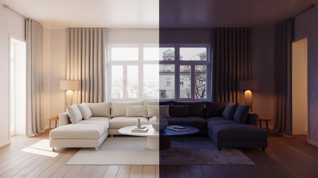
The brightness of your curtains changes how big or small a room feels. Light colored curtains reflect more sunlight and make walls seem farther apart, which is perfect for small rooms or dark spaces that need brightening.
Soft whites, creams, and pastels can open up a cramped room and make it feel airy.
Dark curtains do the opposite by absorbing light and making spaces feel more intimate. They work best in large rooms that might feel empty or cold.
Rich colors like navy, charcoal, and deep green add warmth and coziness to oversized bedrooms or living rooms.
Texture Creates Dimension
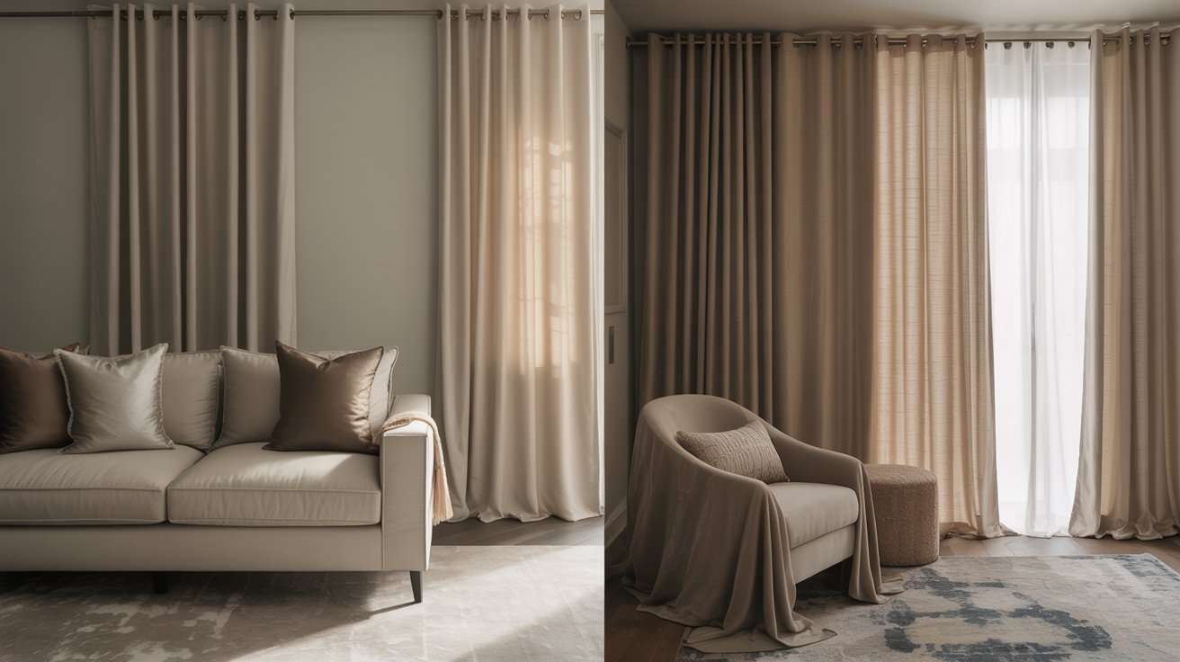
Even when you choose curtains in the same color family as your walls, texture keeps the room from looking flat.
A room with matte-painted walls and smooth silk curtains creates visual interest through different surfaces. Velvet curtains against flat walls add depth without introducing new colors.
Mixing textures matters just as much as mixing colors. A linen curtain and a cotton wall covering both might be white, but they’ll each catch light differently. This creates layers in your design that make the space feel richer and more finished.
Curtain Color Guide for Every Wall Color
Now that you understand the basic rules, let’s look at specific curtain colors that work with common wall colors. These combinations have been tested and proven to create beautiful rooms.
White Walls
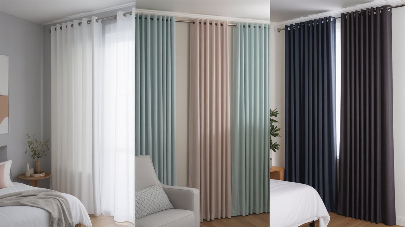
White walls are the most flexible starting point for curtain selection. For a clean, minimal look, choose white or light grey curtains that blend seamlessly with the walls. This creates a bright, open feeling that never goes out of style.
If you want to add a touch of color without going bold, soft pastels work beautifully. Light blues, gentle pinks, and mint greens add personality while keeping the room feeling fresh.
For those who want drama, navy, charcoal, or even black curtains create a strong contrast that makes white walls pop.
Beige and Cream Walls
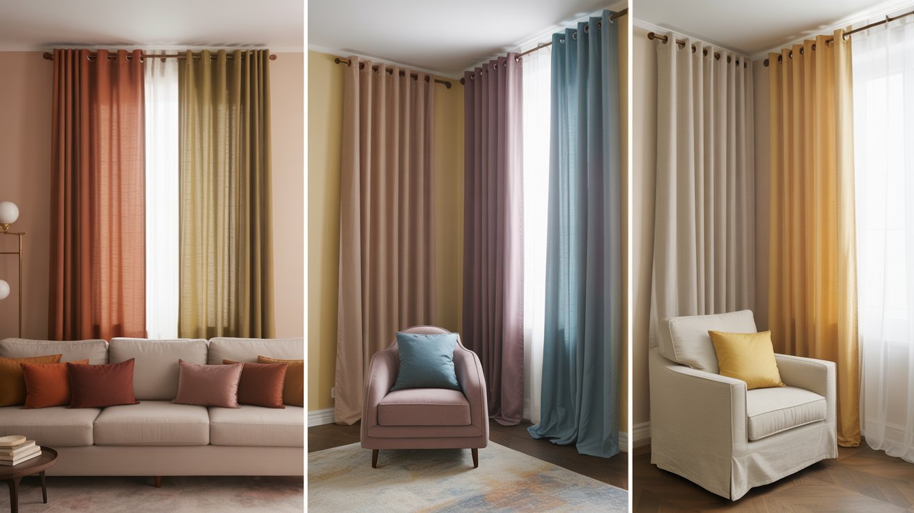
Beige and cream walls have warm undertones that pair well with earthy colors. Rust, dusty rose, and olive green curtains bring out the warmth in these neutral walls. These combinations feel grounded and comfortable, perfect for living rooms and bedrooms.
For a more refined look, deep blues and purples create beautiful contrast against beige without clashing.
On the brighter side, white, cream, or soft yellow curtains keep the room feeling light and open. These neutral-on-neutral combinations never look boring when you play with different shades.
Grey Walls
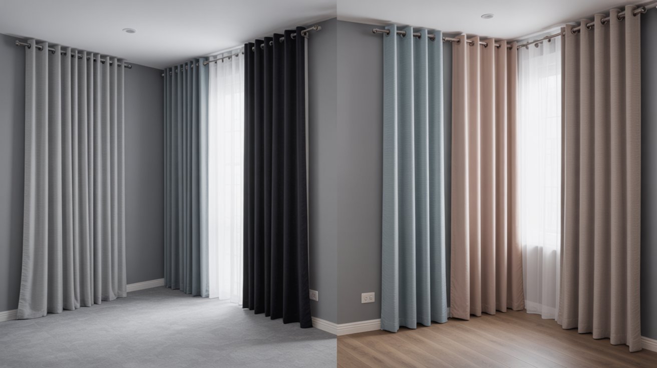
Grey walls offer a modern foundation that works with many curtain colors. For a sleek, contemporary feel, try silver, black, or different shades of grey curtains.
Mixing cool and warm greys adds depth without introducing new colors.
To soften grey walls, powder blue, blush pink, or light brown curtains add warmth. These colors prevent grey rooms from feeling cold or unwelcoming.
The key is choosing curtains with slightly warm undertones to balance grey’s natural coolness.
Blue Walls
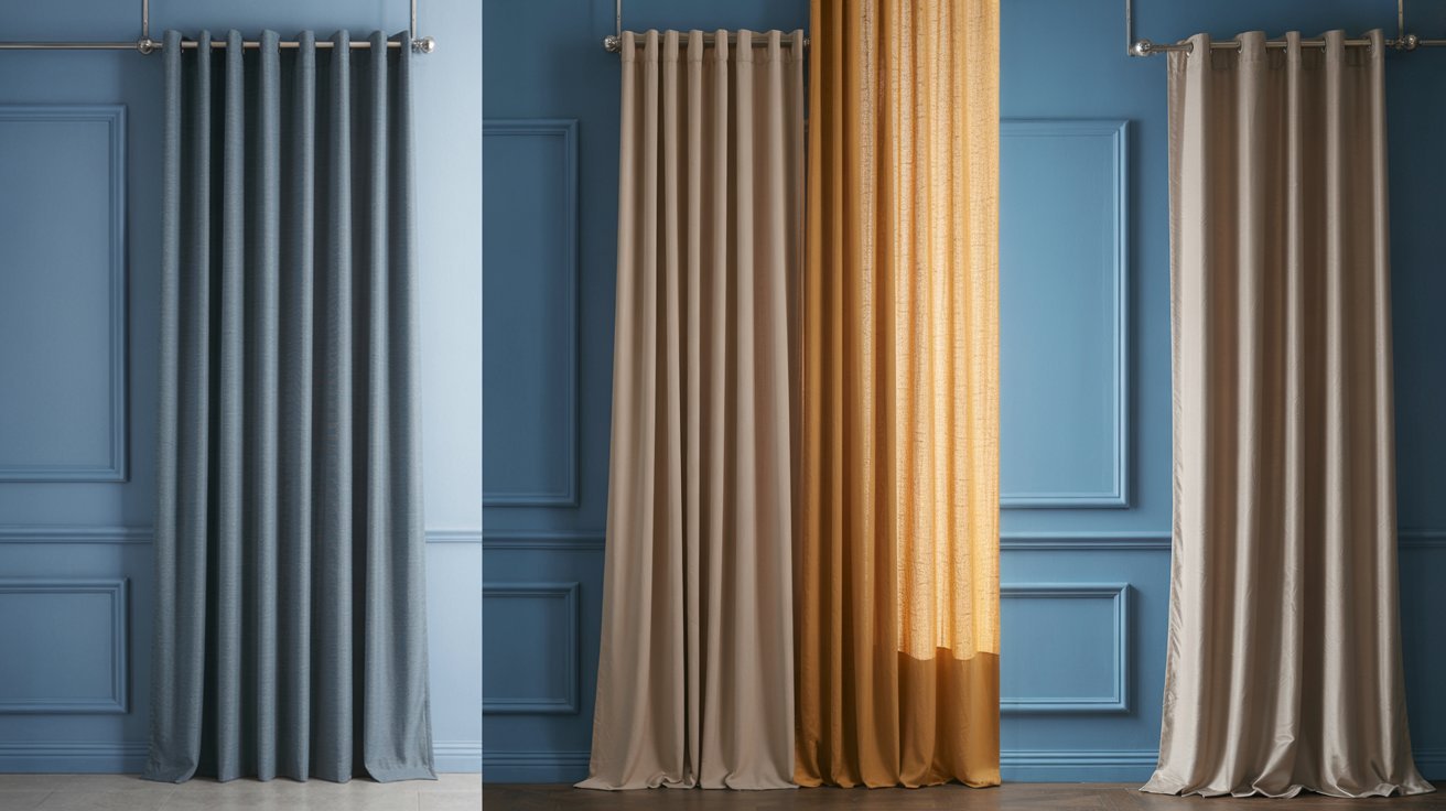
Blue walls create calm, peaceful spaces that work well with several curtain options. Staying within the blue family using different shades creates a monochromatic look that feels cohesive and relaxing. Light blue walls with navy curtains or vice versa both work well.
For contrast, warm colors like beige, mustard, or soft orange curtains balance blue’s coolness. These combinations feel balanced and lived in.
If you want something special, metallic silver or gold curtains add glamour without overwhelming the blue walls.
Yellow Walls
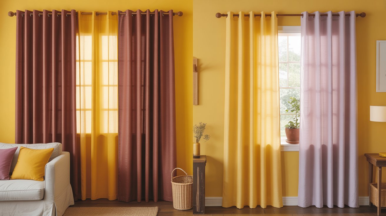
Yellow walls bring sunshine and energy to a room, but need careful curtain pairing. Rich, deep colors like burgundy, chocolate brown, or aubergine curtains ground bright yellow and prevent it from feeling too intense. These combinations feel warm and welcoming.
For a lighter approach, pale yellow or soft lavender curtains keep the room feeling bright and cheerful.
These softer combinations work well in kitchens and breakfast rooms where you want an uplifting mood.
Green Walls
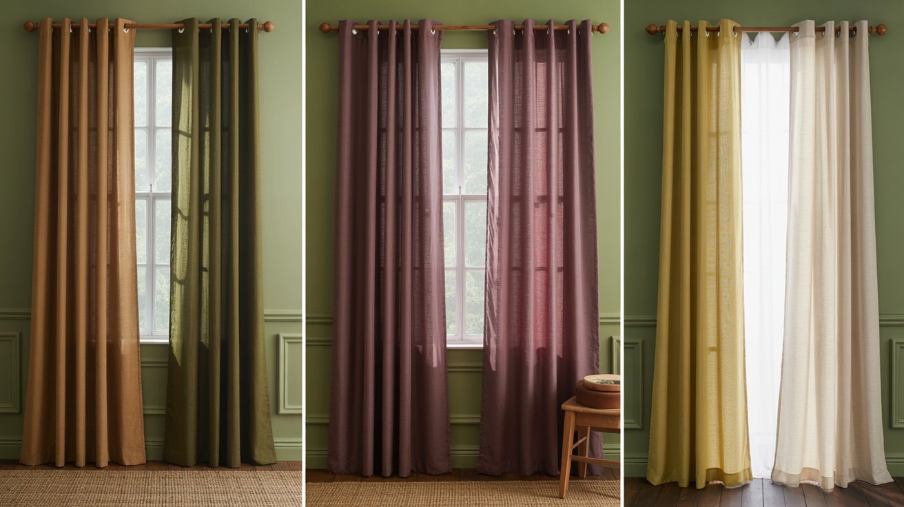
Green walls connect to nature and work beautifully with earth tones. Tan, brown, or deeper forest green curtains create a natural, organic feeling in spaces.
These combinations feel grounded and peaceful, perfect for bedrooms and home offices.
For a richer look, burgundy or plum curtains add depth to green walls. For keeping things light and fresh, ivory or soft yellow curtains brighten green spaces. The key is matching the intensity of your curtain color to your wall shade.
Dark Walls with Dark Curtains
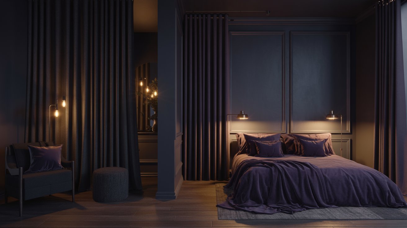
Using dark curtains with dark walls can create a cozy, dramatic space, but it requires careful planning.
The trick is creating subtle contrast through texture and slight color variation. Matte dark walls with shimmery or glossy dark curtains prevent the room from feeling like a cave.
You can also use slightly different shades of the same dark color. Charcoal walls with black curtains or navy walls with deep purple curtains create depth while maintaining the moody feeling. Good lighting becomes extra important in these spaces to keep them from feeling closed in.
When to Choose Curtain Colors in Your Design Timeline
Timing matters when learning how to pick a curtain color. The order in which you select room elements affects how well everything works together.
Why Curtains Should Come Last
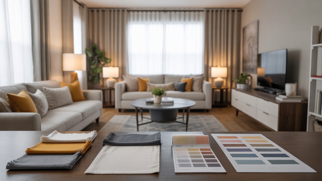
Most designers recommend choosing curtains after you’ve selected your paint color, area rugs, and major furniture pieces.
This approach ensures your curtains tie everything together rather than fighting with other elements. When you shop for curtains with paint swatches and fabric samples from your furniture, you can see exactly which colors work.
Starting with larger, more permanent items makes sense because these are harder to change. Paint is a bigger project than buying new curtains, and furniture represents a bigger investment. Curtains become the finishing touch that pulls your entire color scheme together.
The Exception: Statement Pattern First
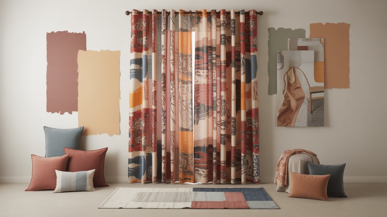
Sometimes you’ll fall in love with a patterned curtain that’s too perfect to pass up. In these cases, the curtain fabric can become your inspiration for the entire room.
Pull colors from the pattern to use on walls, choose furniture that complements the curtain’s style, and let this bold choice guide your other decisions.
This reverse approach works when the curtain fabric truly speaks to you and contains multiple colors you can work with.
Make sure the pattern includes enough colors to build a complete room scheme around it. This method requires more planning but can result in a unique, personal space.
Pro Tips for Selecting the Perfect Curtain Color
Making the final decision on how to pick a curtain color becomes easier when you follow these professional tips.
These small steps prevent expensive mistakes and ensure you’re happy with your choice.
- Always order fabric swatches to test in your actual lighting. Seeing the actual fabric in your room shows you the true color and texture. Natural light changes throughout the day, so check your swatches in morning, afternoon, and evening light.
- Consider how room type influences boldness in your color choice. Living rooms can handle more adventurous colors since they’re social spaces where energy is welcome. Bedrooms usually benefit from calmer curtain colors that promote relaxation.
- Look at your trim color for subtle coordination that makes a big difference. Matching your curtains to white trim creates a clean frame, while coordinating with wood trim adds warmth throughout the space.
- Account for changing natural light throughout the day before making your final decision. What looks perfect at noon might look completely different at sunset. Check how your curtain color appears in different lighting conditions.
- Don’t forget your furniture and rug colors in the overall scheme. Your curtains need to work with these elements, not compete with them. If your sofa is a bold color, you might want simpler curtains. If your furniture is neutral, your curtains can be where you add personality.
Small details like these make the difference between a room that looks thrown together and one that looks professionally designed.
Taking time to consider each factor ensures your final choice enhances both the mood and function of your space.
Conclusion
Learning how to pick a curtain color comes down to balancing proven design rules with your personal taste. Remember the 60 30 10 rule for color distribution, understand how light and dark colors affect room size, and consider texture as part of your color choice.
Most importantly, always test fabric samples in your actual space before making a final purchase. Think about what mood you want each room to have. Do you want energizing spaces or calming retreats? Let that guide your color choices. Take your time with this decision since curtains are visible every day and changing them requires effort.
The right curtain color should make you smile every time you walk into the room. Enjoy the creative process and trust your instincts once you’ve learned the basic principles.
Frequently Asked Questions
Can I use patterned curtains with patterned wallpaper?
Yes, but use different pattern scales and make sure they share at least one common color. A large floral wallpaper can work with small geometric curtains. Keep one pattern subtle to avoid visual chaos.
Should curtains be lighter or darker than furniture?
It depends on what you want to emphasize. Lighter curtains recede into the background and highlight your furniture. Darker curtains become a focal point and can balance light colored furniture nicely.
How do I choose curtain colors for rooms with multiple wall colors?
Look for the undertones that your different wall colors share. Choose curtains in a neutral that contains those undertones, or pick up one color from your walls and use it for the curtains.
What curtain colors work best for small rooms?
Light colors make small rooms feel more spacious. White, cream, pale grey, and soft pastels reflect light and push walls outward visually. Vertical stripes can also make ceilings seem higher.
Do metallic curtains work with any wall color?
Metallic curtains are very flexible since they reflect surrounding colors. Silver works best with cool tones, while gold suits warm colors. They add shine to any space but work especially well with neutral walls.
Leave a Reply